Advertisement:
Zara's New Logo Gets Squeezed & The Only Thing Which Is Extending Is 'The Memes'
Date: 2019-02-06 21:03:08
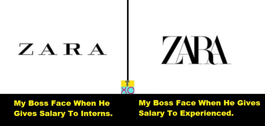
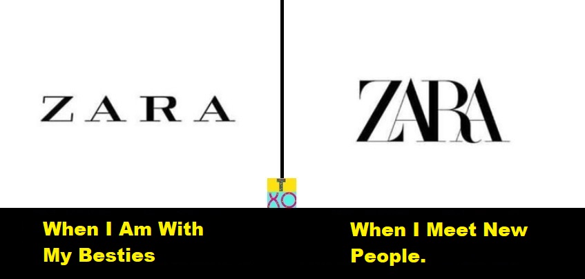
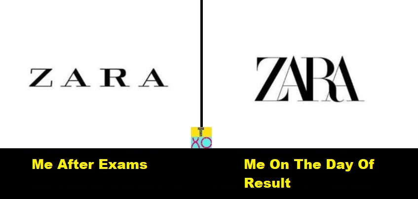
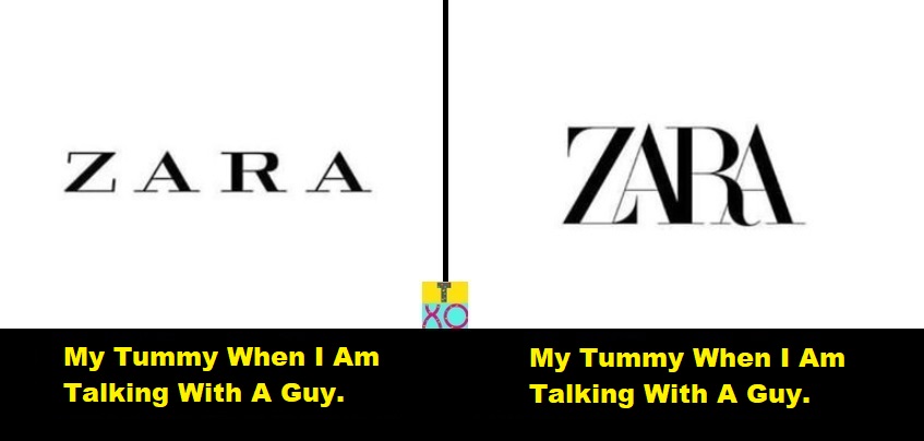
Zara, the fashion brand has redesigned their logo.
Earlier the letters in the logo were spread evenly, there were generous gaps and the logo looked wide in structure but the letters are overlapping each other, which looks little compact now.
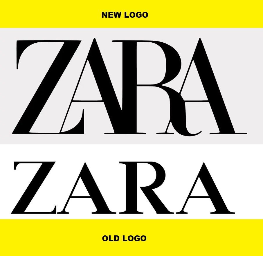
Looks like Zara logo wants to go 'slim and trim', isn't it?
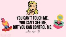
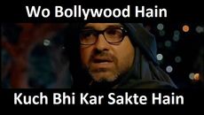
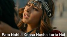
While the reactions from the netizens are worthy to be shared with you all but before that, allow us to share our custom made posters which we hope you all will like!
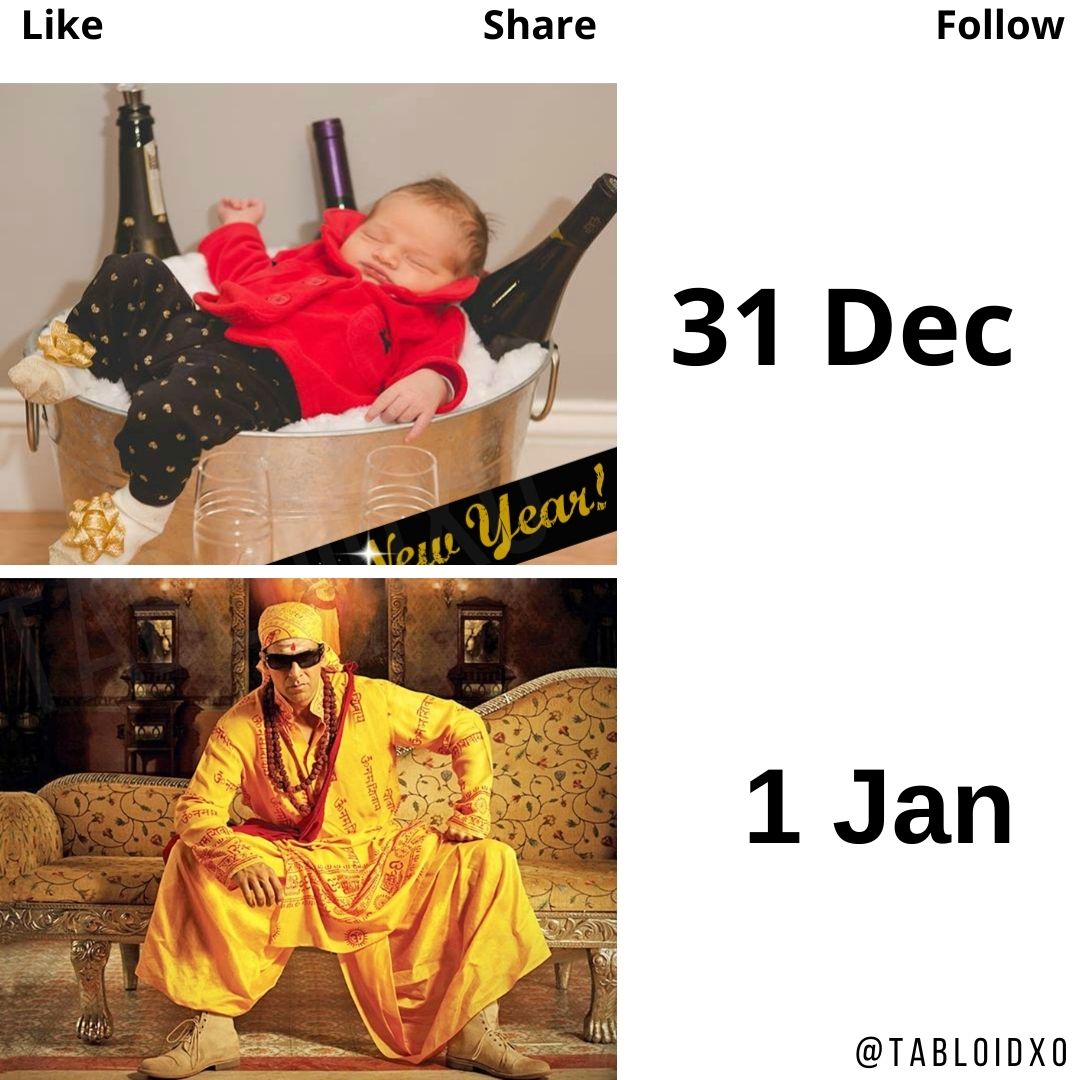
1.
Also Read: Buy GRENARO S12 Mic for YouTube or Videos.
Also Read: Buy Amazon Echo Pop | Smart speaker with Alexa and Bluetooth.
Also Read: Amazon Echo Dot (5th Gen) | Smart speaker with Bigger sound, Motion Detection, Temperature Sensor.
Also Read: 10 Best Ideas To Impress Guest At Wedding.
Also Read: 8 Things We Can Copy From Indian Celebrity Weddings.
Advertisement:
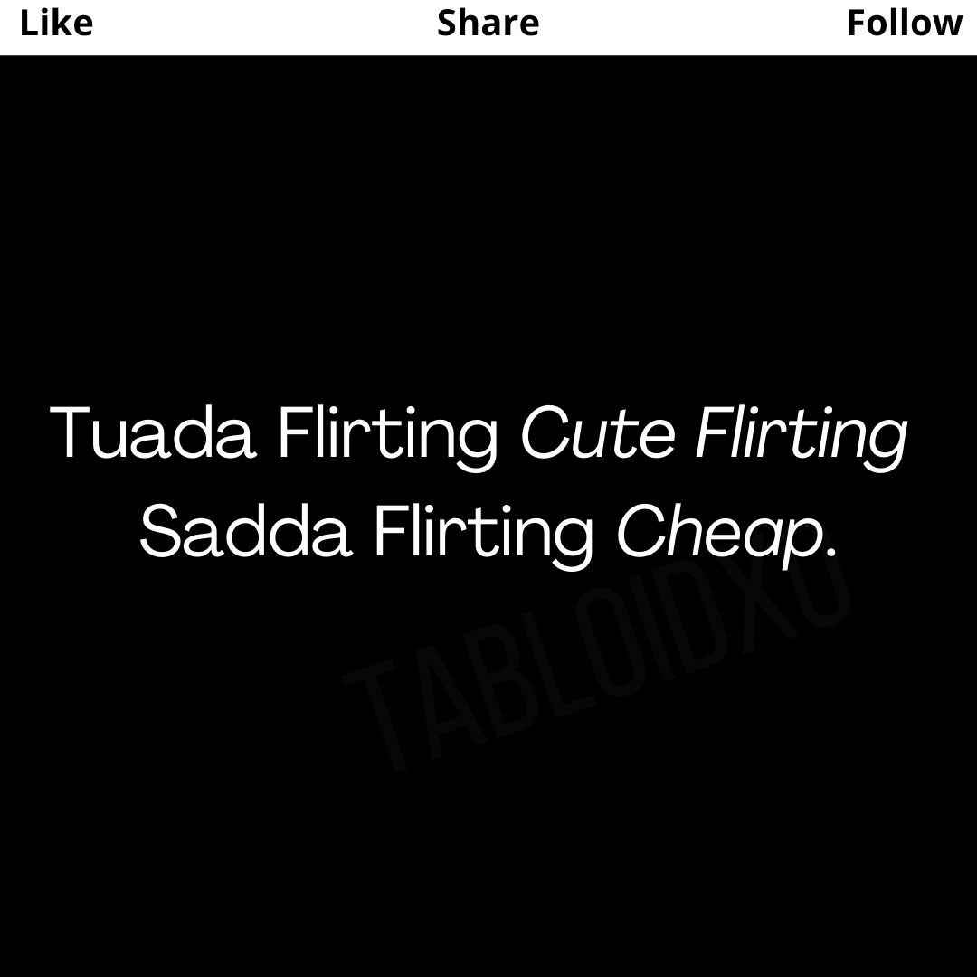
2.
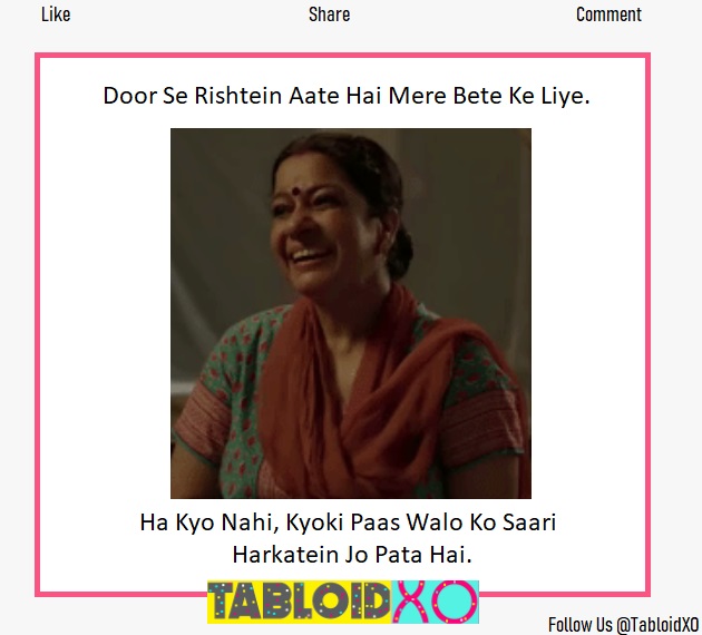
3.
4.
Also Read: Buy Air Purifying Plants For Your Home.
Also Read: 'New Year, New Me' Outfits You Can Try in 2025.
Also Read: What Will Be Your Relationship Status In 2025? Take This Quiz.
Also Read: 18+ Funny Marriage Quotes For The Newlyweds.
Advertisement:
Since it's launch, Zara has changed their logo Twice, the first time they altered was back in 2011. The designers behind the compact logo are Baron & Baron design house.
And here's how Netizens spiced up the squeezing game:
User's: the new Slack logo was awful
— Abdulsamad Umar (@justabdulsamad) January 27, 2019
ZARA: hold my beer... pic.twitter.com/8NmOK3Pqfp
Also Read: 70+ Unique Wedding Hashtags We Made Only For Your Grand Wedding.
Advertisement:
I memed #designerhumour #zara #zaralogo #brand #tracking pic.twitter.com/4C7VhYe2Uu
— Tim Davis (@holopress) January 31, 2019
Thank-you for coming to my TedTalk #Zara pic.twitter.com/BqiJMWefmH
— Taya Try 🌈 (@soyuxr) January 29, 2019
The new Zara logo looks like the old Zara logo wearing a Zara slim fit shirt. pic.twitter.com/9fV6dCz6JP
— Sahil Shah (@SahilBulla) February 5, 2019
What's your feedback?? Thumbs Up or Thumbs Down?
Advertisement:
Trending Now.
...Play Quiz. →
Trending Memes. →
Latest Stories.
©To Clap2Ram Media (TabloidXO™)
Trending Now
Advertisement:


